Simplecaps: A Clean, Cap-Only Script Font for Digital Branding
It started with a hero section. I was redesigning a boutique coaching site—soft colors, ample whitespace, and a strong desire to convey warmth without sacrificing clarity. The headline needed personality: not cold, not generic, but unmistakably human. I dropped in Simplecaps for “Your Calm Starts Here” and paused. It didn’t shout. It smiled. Light, airy, and effortlessly intentional—like handwriting that’s been gently refined for the screen.
A Script Font That Breathes on the Web
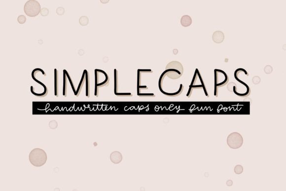
Simplecaps is a script font—but not the kind that swirls or swoops. It’s clean, modern, and entirely uppercase. No lowercase letters, no italics, no alternate glyphs—just one confident, friendly weight of all-caps characters and numerals. As a web designer, I appreciate how its simplicity avoids visual noise while still carrying expressive charm. It’s a display font first and foremost: designed for impact, not endurance. Think of it as the typographic equivalent of a well-placed accent wall—not the whole room, but the detail that makes everything feel considered.
How It Performs in Real Layouts
I tested Simplecaps across multiple contexts: a product landing page header, a CTA button on a dark-mode blog, an overlay on a hero image banner, and even a subtle tagline beneath a logo lockup. On desktop, it shines—especially at 36px and up. The letterforms have just enough contrast and open counters to stay legible against busy backgrounds. On mobile? Still readable at 28px when paired with generous line-height and padding. I avoided using it below 24px—it begins to lose its friendliness and starts feeling cramped, especially on lower-DPI screens.
What surprised me most was how well it held up over photography. Its even stroke weight and consistent spacing meant no awkward “disappearing letters” against textured or gradient overlays. Unlike some delicate scripts, Simplecaps doesn’t vanish into shadows or get lost in light areas—it anchors itself with quiet confidence.
Where Simplecaps Adds Real Digital Value
This font earns its place in digital work where tone matters as much as function:
- Landing page headlines — Gives immediate warmth to service-based sites (coaching, wellness, creative studios)
- Section dividers and subheads — Adds rhythm without competing with body copy
- Branded graphics for social or email — Works beautifully in Canva or Figma templates meant for non-designers
- Digital brand kits — Serves as a memorable secondary typeface alongside a neutral sans serif
- Course or membership site accents — Makes “Welcome,” “Bonus,” or “Module One” feel special, not sterile
I used it for a small business portfolio site’s “Work” section title—and instantly noticed how it elevated the perceived craftsmanship of the projects shown beneath it. Not flashy, but quietly premium.
Smart Pairings and Practical Limits
Simplecaps thrives when paired intentionally. I consistently paired it with a neutral, highly legible sans serif—think Inter, Poppins, or even system fonts like -apple-system—for all body text, navigation, and form fields. That contrast does heavy lifting: Simplecaps brings voice; the sans serif brings clarity and trust. I avoided pairing it with other decorative fonts—no competing scripts or overly stylized serifs. Less clutter, more cohesion.
It’s not built for long-form reading. Don’t use it for paragraphs, pricing tables, or legal footers. Skip it for navigation labels, mobile menu items, or form inputs—its decorative nature sacrifices functional precision there. And while it includes numbers, avoid using it for data-dense contexts like stats dashboards or comparison charts. It’s a storyteller, not a spreadsheet.
Technical Notes for Real Projects
Before dropping Simplecaps into a live site, I checked three things: file format support (it comes in .woff2, perfect for web), commercial licensing (yes—it covers client sites and SaaS platforms), and character coverage (full Latin-1, so solid for English, Spanish, French, German, etc.). No swashes or ligatures—so no surprises in CSS font-feature-settings—and no variable weight axis, which kept my font loading lean. For responsive typography, I used clamp() values to scale it gracefully from 24px on mobile to 48px on large desktops—always keeping spacing tight but never tight enough to blur letter separation.
One final note: if you’re embedding it via @font-face, test fallback behavior. A well-chosen system font stack (e.g., "Simplecaps", -apple-system, BlinkMacSystemFont, "Segoe UI", sans-serif) ensures your headline never collapses into unreadable default text—even if the custom font delays or fails.
Simplecaps won’t solve every typographic challenge—but it solves a very specific, very common one: how to add humanity to a digital interface without compromising polish. It’s the kind of font that makes visitors pause, not because it’s loud, but because it feels like it was chosen with care. And in today’s sea of sameness, that kind of intentionality is quietly powerful.